“`html
How to Appreciate the Art on Belgian Beer Labels
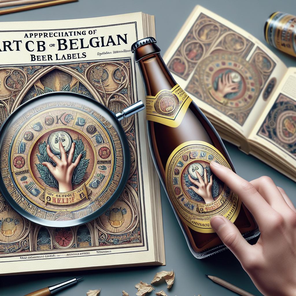
Belgian beer is celebrated globally, not just for its rich flavors and brewing traditions but also for the exquisite artwork displayed on its labels. The art on Belgian beer labels is an intricate blend of historical richness, cultural nuances, and modern design philosophies. By exploring themes ranging from the medieval charms of Gascony to the vibrant subculture of heavy metal, these labels offer a visual feast that’s as complex as the beers they adorn. In this article, we’ll uncover the stories behind these artistic choices. We will delve into how sobriety and recognisability play crucial roles in the branding process and explore the shared philosophies that connect various beer producers. This journey through the art of Belgian beer labels offers insights into a unique form of artistic expression that is both a reflection and an extension of Belgian culture itself.
From Gascony to St Gills
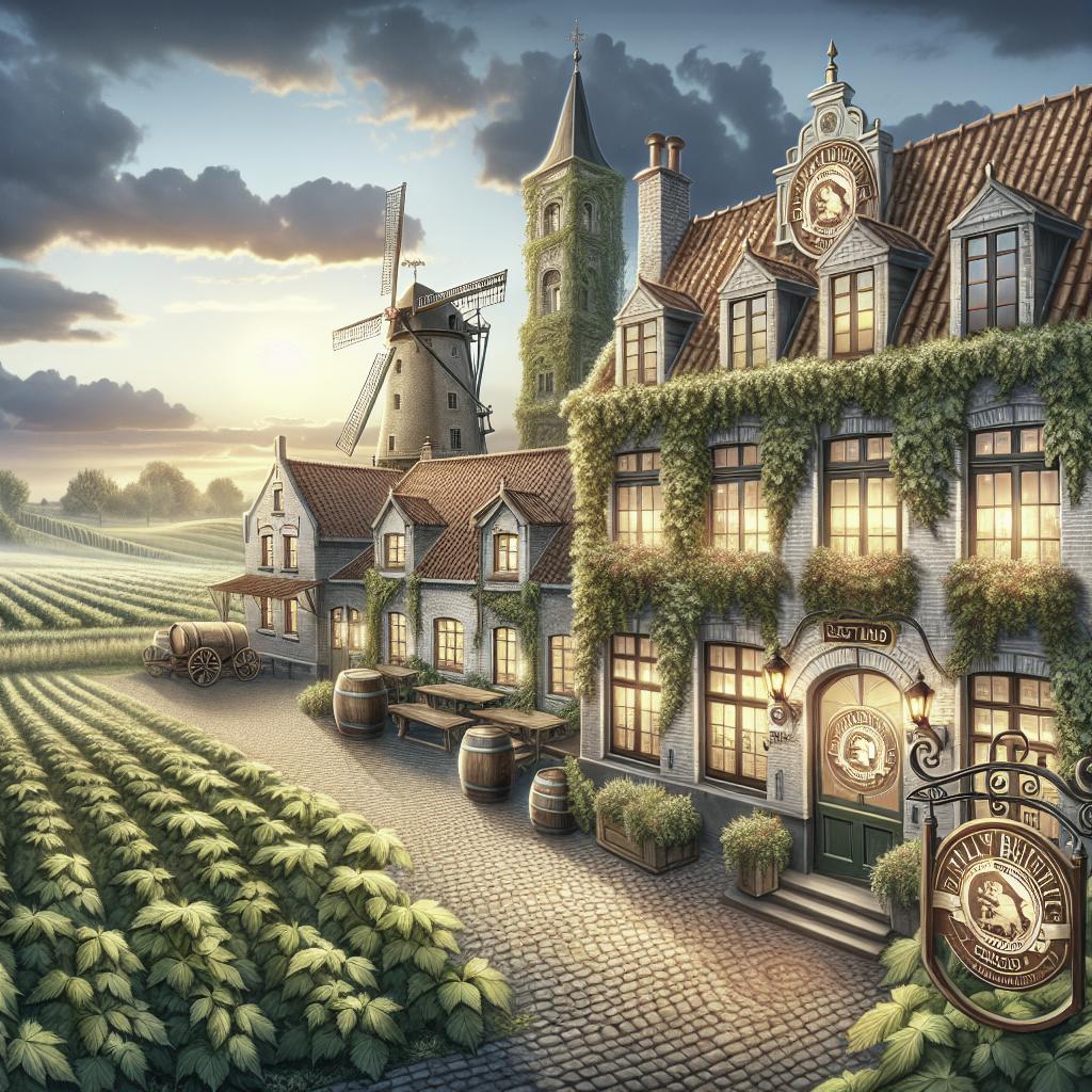
The picturesque region of Gascony has long been an inspiration for artists, with its rolling landscapes and historical architecture. This influence extends to the beer labels designed for Belgian brews, which often incorporate rustic imagery and medieval motifs reminiscent of Gascony’s charm. The use of rich, muted tones and elaborate heraldic symbols is common, reflecting the deep-rooted history and heritage that Belgian brewers are eager to showcase. These labels serve as a visual gateway, inviting consumers to take in the story of the beverage even before the cap is off.
In contrast, the bustling neighborhood of St Gills in Brussels has inspired a more contemporary artistic wave. Here, the beer labels echo the vibrancy and diversity of urban life, employing bright colors and abstract designs. Artists in St Gills have an inclination to challenge traditional norms, integrating modern art forms and street art influences into their creations. This artistic diversity on Belgian beer labels is a testament to the country’s open embrace of both historical reverence and modern innovation.
Headbangers and Heavy Metal
Heavy metal music, with its dramatic and often dark thematic elements, finds an unexpected ally in Belgian beer labels. Several breweries have embraced the edgy aesthetics of heavy metal, crafting labels that feature bold, sinister graphics with aggressive color palettes. These designs cater to niche audiences who appreciate the raw energy and countercultural ethos that the heavy metal scene represents. The imagery typically includes elements such as skulls, serpents, and intricate fonts that echo the sound and spirit of the music.
By aligning with this subculture, Belgian brewers not only diversify their appeal but also demonstrate a keen awareness of contemporary tastes and cultural trends. The integration of heavy metal motifs connects beer with music, a pairing as old as drinking itself, creating an immersive experience that resonates with drinkers who thrive in loud, expressive atmospheres. This infusion of music subcultures into label design exemplifies the multifaceted identity of Belgian beer and its ability to transcend traditional boundaries.
Sobriety and Recognisability
While some beer labels opt for flamboyance, others prefer a minimalist approach that emphasizes sobriety and recognisability. In Belgian brewing, many brands prioritize clean lines, simple color schemes, and iconic symbols that are instantly recognizable in a crowded marketplace. This strategy isn’t just about aesthetics—it’s about building a strong brand identity that remains imprinted in consumers’ minds. Labels that lean towards simplicity often make clever use of typography and negative space, expressing elegance and sophistication.
This approach caters to a wide audience looking for relatability and reliability in their beverage choices. Belgian breweries often employ traditional iconographies, such as monastic imagery or landmarks, which enhance the labels’ authenticity and heritage appeal. The balance between artistic restraint and impactful design is pivotal, ensuring the beer label communicates quality without distraction, enticing customers with clarity and purpose.
Shared Philosophies
Underlying the diversity in Belgian beer labels is a shared philosophy that unites the country’s brewers: a respect for tradition coupled with an eye towards innovation. This duality is reflected in the artwork, where timeless symbols coexist with contemporary design elements. Whether showcasing time-honored brewing methods or experimenting with new flavors, the labels serve as a canvas for brewers to express their ethos and passion.
Another philosophy shared across Belgian beer artistry is the narrative connection between label and beer. The art is not merely decorative; it is informative, often providing subtle hints about the flavor profile, brewing history, or even pairing suggestions. This storytelling aspect enriches the consumer experience, turning the act of choosing a beer into an exploration of culture and craftsmanship. In essence, Belgian beer labels are about more than aesthetics—they are a testament to a dynamic cultural legacy.
Summary of Main Points
| Theme | Details |
|---|---|
| From Gascony to St Gills | Explores the influence of historical and urban settings on beer label art, blending medieval imagery with modern design. |
| Headbangers and Heavy Metal | Highlights the integration of heavy metal aesthetics into Belgian beer labels, appealing to contemporary cultural trends. |
| Sobriety and Recognisability | Focuses on minimalist label designs that prioritize brand identity through simplicity and tradition. |
| Shared Philosophies | Discusses the underlying shared commitment to tradition and innovation in Belgian beer label artistry. |
“`